Designers often say “A picture is worth a thousand words.” This is also a very popular PPT design concept, using full-screen images with short sentences to project emotions or set off the story being told. With the rise of copyright awareness, everyone has also learned to find free commercial libraries, but what next? What pictures are suitable for your PPT?
Many PPT design teachings will highly recommend the use of pictures, because you can turn concepts into images, which not only increases the audience’s interest, but also keeps the memory related to the images in the brain longer; at the end, they will list various commonly used free images. Commercial picture websites, such as unsplash, pexels, pixabay, and xframe, everyone quickly copies them and then goes home happily. Alternatively, it is recommended that you use AI tools to generate PPT directly, such as Bestppt.
Unfortunately, how can we apply what we have learned? But few people will mention it.
This week we will take a look at how to find pictures suitable for your presentation among the abundant resources. Let’s start with the errors that are easiest to correct.
Level 1: Ignore copyright
Don’t think it’s a joke, I’ve seen the company’s internal PowerPoint, the pictures in the slides, and the watermarks on the website. Some people have a misconception that on paid photo gallery websites, the small pictures that you can view before paying are free, and only high-resolution pictures need to be paid for. Whether you use images with watermarks without authorization or use photoshop or artificial intelligence tools to remove watermarks from images, it is a copyright infringement. It may not have been easy to find free large images in the 1990s, but that’s no longer an excuse for laziness.
Level 2: Too lazy to search for pictures
People who have been working in the workplace for a while usually don’t make Level 1 mistakes. But when people get lazy, there are thousands of free stock photos of no use, because everyone uses the same picture. Unless you have a unique free commercial gallery, in fact, everyone just goes back and forth to those few websites to find pictures. To avoid the embarrassment of “colliding pictures”, please don’t waste a minute. Don’t choose on the first page of the search results. At least the second, third and fourth pages can also reduce the audience’s “Oh, that one again” “Zhangtu” gave you the opportunity to sigh, and then no one came to listen to the touching story you prepared.
Level 3: Matching for the sake of matching
Not all PPT situations are suitable for using full-screen graphics, such as department performance, internal analysis, etc. Even if full-screen graphics can be used, it does not mean that every part of the PPT is required. Repeated use of the same trick will not only reduce the effectiveness of image delivery, but also may lead to forced insertion of images. For example, some news websites, when reporting on the epidemic, want to add some images to avoid turning it into a full-text report, but the following choices are meaningless pictures. Pictures have their role, but you should also pay attention to the necessity of pictures in your PPT process and content.

Or maybe you are introducing your product or company’s vision at a fund-raising event, and then add the following pictures. Why not just add pictures for the sake of pictures?

Level 4: Cartoon style
Once you understand that the images you choose need to be necessary and unique, the next step is to eliminate images that make you look unprofessional. Cartoons are something that should be carefully avoided. Of course, if the presentation target is children, it is acceptable to use cartoon-like pictures. However, presentations in offices, especially in companies, are similar to the style of the previous MS Word Clipart. Make your colleagues and superiors look at you differently.

Level 5: Pretentious posing
So instead of cartoons, we use pictures of real people, which will always have enough style, right? Some companies will hire a group of people to wear suits and pose in various poses, and then put them on picture websites for people to download. The problem is, most of these staged images have a cheesy feel to them and may not be appropriate for your presentation. For example, if you want to express anger, the image below has a chance of making your audience laugh (unless that’s the purpose of your presentation).
Many content farm websites, because they need a large number of pictures to attract traffic, especially like these close-up posed photos. So, do you want to bring your PPT to the level of a content farm?

Level 6: Cluttered background
There are also many requests for real people and cartoons, so the objects will be simple, right? If you want to use pictures of objects to match the short sentences on the presentation slide, it is best to fade the background so that the audience’s eyes can naturally focus on the sentences. Of course, if the background is cluttered, you can still use color squares to highlight the sentences. But the clearer the background, the more relaxed the audience will feel. Assuming that your PPT today is to show your favorite game, the following is a comparison of the two pictures:


Everyone is searching for free photo galleries, how can you search better than others?
Seeing this, you might say, “Everyone can criticize, how about you show me how to do it?”
In addition to six minefields to avoid today, the solution to pairing your presentation with images that are appropriate, unique, and not overly flashy is image depth. Just like telling a joke, if it is too simple, you will laugh immediately, but it will be forgotten soon; a thoughtful joke that only laughs after thinking about it may be more impressive.
The depth of a picture lies in not searching for it with the first word that comes to mind.
You can use different tools, such as a mind map or drawing on paper, to spread out the nouns, adjectives, actions, etc. related to the word layer by layer. By the second, third, or above level, you The image results you search will naturally have a flavor that matches the story you express.
During internship time, we will try again to find pictures about anger.
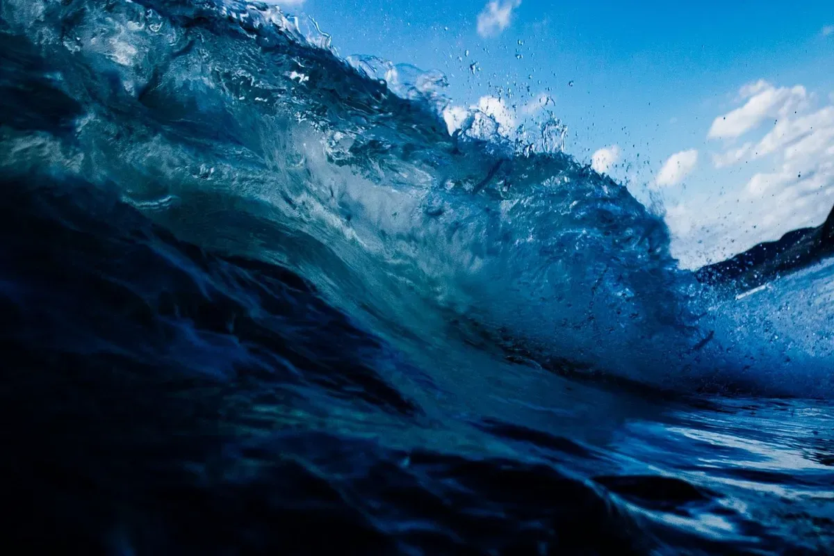
This time we are not searching for “anger”, but from “angry” to mood, then to “turbulence”, and then to “waves” to express that anger has overwhelmed your reason, and as a result, you have done something that hurt your partner. Or family matters.
Let’s take another example. For the popular cryptocurrency, of course you can directly search for bitcoin. In fact, there are many pictures for you to choose from. However, it is also because of the popularity of cryptocurrency that articles or briefings about cryptocurrency are overwhelming. Are you worried that if you choose the following picture, it will give the audience an image of “it’s this again” when you go on stage?Do you find it more profound to use this kind of picture to express the anger that overwhelms your reason?

Let’s take another example. For the popular cryptocurrency, of course you can directly search for bitcoin. In fact, there are many pictures for you to choose from. However, it is also because of the popularity of cryptocurrency that articles or briefings about cryptocurrency are overwhelming. Are you worried that if you choose the following picture, it will give the audience an image of “it’s this again” when you go on stage?

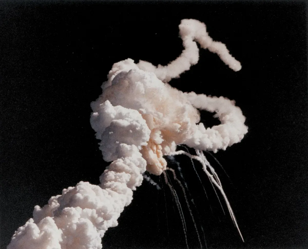
We are trying to increase the depth of the picture again. From “cryptocurrency”, we will naturally think of “price rise and fall”. At this time, you have to suppress the urge to find a “line chart” because it is still too superficial. Then think of the price adjustment from “Rocket”, and the result can be used as the background of the following picture:

This is an image with a full four levels of depth:
1. Prices rise like a rocket and can fall at any time
2. Elon Musk, the aerospace/electric vehicle tycoon who can dominate the cryptocurrency market with just his words
3. What exploded in the picture was the Challenger space shuttle, and cryptocurrency is seen as challenging legal tender. So will Bitcoin succeed?
4. Have the newly entered cryptocurrencies learned from the lessons of their predecessors, learned from Bitcoin’s strengths and weaknesses, and made greater progress in the future?
A picture already has enough material for you to tell a few short stories. Compared with the previous cold picture, on the one hand, you use curiosity to guide the audience to guess what you want to say and catch their attention. It can also touch the emotions and resonance of the audience, making your expression three-dimensional and multi-faceted, thereby achieving a deeper impression.
The emergence of free commercial libraries has made it easier to prepare PPT; but also because the starting line has become similar, the designer’s level of thought can be seen in the skill of finding pictures.
With the development of AI, PPT design has become simpler. AI can help you write copy, make templates, and layout. For example, Bestppt, you only need to enter a theme, and it can complete the production of a complete PPT in 3 minutes. You only need to make a slight modification before you can use it, which greatly improves work efficiency.
