You don’t need to be a professional designer to create beautiful PowerPoint presentations. These nine tips can help create efficient, eye-catching slides.
How many poorly designed PowerPoint presentations have you ever seen that were boring, confusing, and distracting? Probably too many. Although we all hate boring PowerPoints, when it’s our turn to make them, can we really do better? The good news is that you don’t have to be a professional designer to know how to create a great and attractive presentation.
Here are a few simple rules and techniques you can follow to create professional, beautifully designed slideshows. Since PowerPoint continues to be one of the most popular presentation design software in existence, we’re going to share some design tips and tricks to maximize your PowerPoint skills so you can really shine the next time you stand in front of a crowd.
1. Make good use of layout
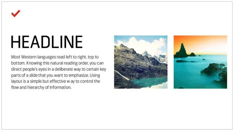
Most languages are read and written from left to right, top to bottom. Knowing this reading order, you can intentionally direct the audience’s eyes to the important parts of the slide that you want to emphasize. Using layouts is a simple but effective way to control the direction and visual hierarchy of your message.
You can simply adjust the layout to lead your audience. Use text size and switch fonts or colors to differentiate between titles and body text. Placement is also important. There are many unorthodox ways of constructing a slide show, but most viewers will need to spend some time organizing the information in their minds — time that is valuable and would be better spent listening to the explanation and absorbing the information.
Try organizing your slideshow like this:
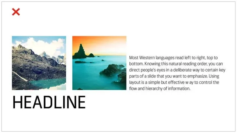
instead of like this:
2. Not using sentences
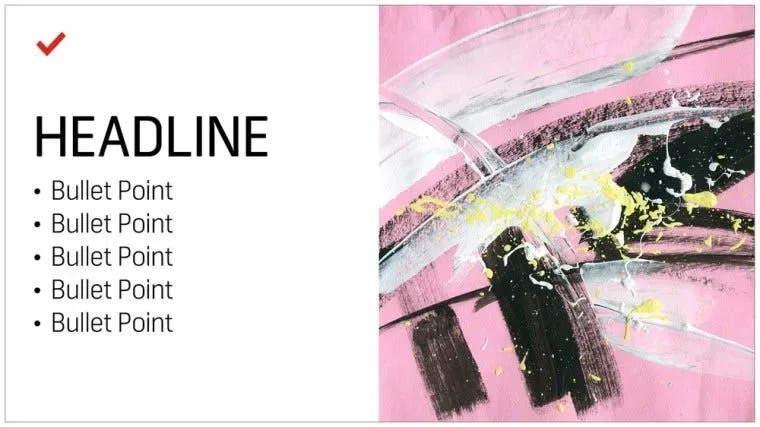
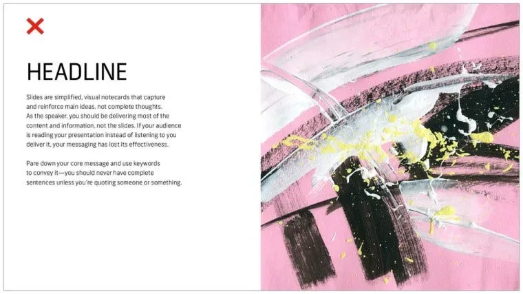
Slides are simplified visual notecards used to capture and capture key concepts rather than complete ideas. As a speaker, you should convey most of your content and message, rather than putting everything on a slide for everyone to read (or perhaps ignore). If your audience is reading the briefing instead of listening to the instructions, your message loses its effectiveness.
Collate your core message and pare it down into keywords — you should avoid complete sentences unless you’re quoting someone else or saying something famous.
persist in:
instead of like this:
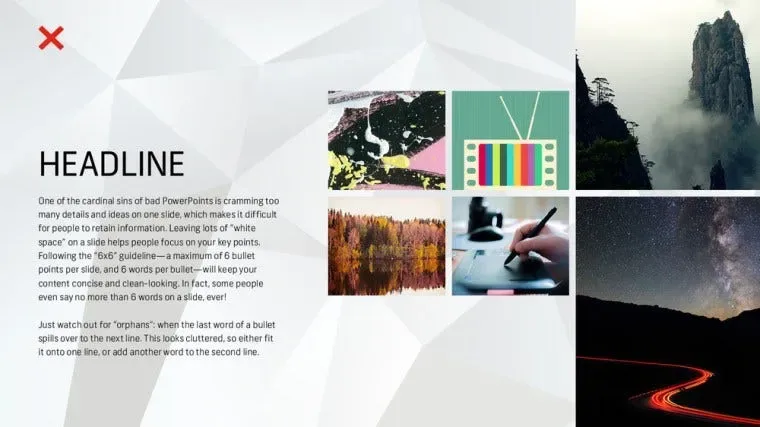
3. Follow the 6×6 rule
One of the main mistakes of bad PowerPoints is cramming too many details and ideas into one slide, which makes it difficult for people to get the information. Keeping a lot of “empty space” in your slides helps viewers focus on key points.
Try using the 6×6 rule to keep your content simple and clean. The 6×6 rule means that each slide should convey a maximum of six key points, with a maximum of six words per key point. In fact, some people even say that each slide should have no more than six words! Just be aware that “words are not in rows” (the last word of a sentence/phrase is moved to the next line). This will look cluttered, so squeeze it into the same line or add a few more words on a second line.

Slides should never have this much information:
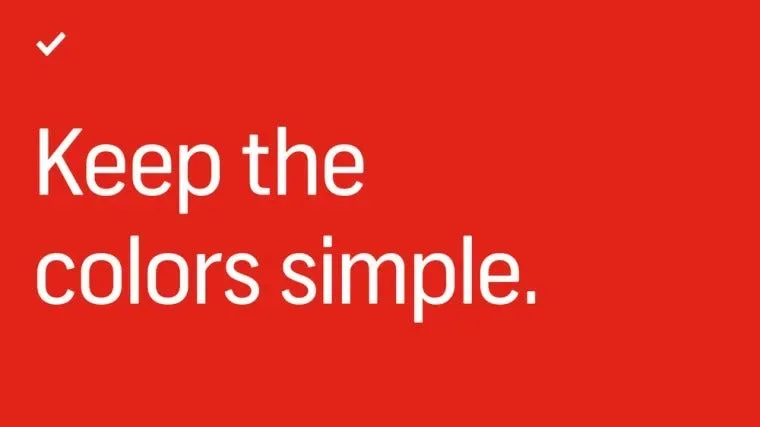
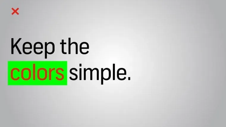
4. Keep colors simple
Choose simple shades of color. Text that is too bright can cause eye strain, so use those colors sparingly. Dark text with a light background, or light text with a dark background is best. Also avoid using strong gradients that make the text difficult to read.
If you’re making a presentation on behalf of a brand, review the company’s brand guidelines. Companies often have primary and secondary brand colors, and it’s a good idea to use them in your briefs to tie your brand identity and style together.
Avoid using colors like this:
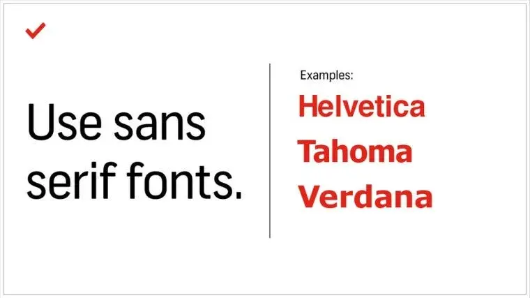
5. Use sans-serif fonts
Traditionally, serif fonts (Times New Roman, Garamond, Bookman) are best for printing, while sans-serif fonts (Helvetica, Tahoma, Verdana) are easier to read on the screen. They are always a safer bet, just remember to put readability first when choosing.
Try to use one font throughout, or at most two. Typefaces have very different characteristics and emotional impact, so make sure they match the tone, purpose, and content of your presentation.
6. Stick to font sizes of 30 or larger
Many experts agree that the font size should be at least 30. This not only ensures the readability of the text, but also forces you to include only the most important information and explain it efficiently since space is limited.

7. Avoid applying too many styles to text
The three simplest and most effective ways to make text attract attention:
Bold
italics
change color
Our eyes are naturally drawn to what stands out, but use these variations with caution. Too many styles can make your slides look cluttered and distracting.
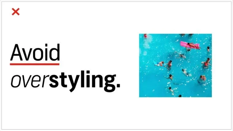
8. Choose the right image
The images you choose for your presentation can be just as important as the message. You want the image to not only support the message, but even to elevate it — a rare feat in the often boring world of PowerPoint. But what are the appropriate images? Let’s be honest. There are no direct answers to this conceptual and almost mysterious topic, but we can break down some strategies for choosing images to help you create your next presentation.
Ideal image characteristics for presentations:
Related
reality
Inspire

These qualities may seem vague, but the general idea is to go beyond the literal meaning. Think about the symbols in the pictures and the stories they tell. Think about the color and composition of the image, as well as the unique mood that the brief sets. This way you can find creative images that are relevant, authentic and inspiring.
Here are some more guidelines for choosing good photos.
Illustrative, not generic
So, the slide we are about to discuss is about teamwork. Naturally, you’d want to find photos of meetings in conference rooms, right? While it’s perfectly fine to take things literally, sometimes these images can be poor; literal meaning doesn’t necessarily connect emotionally with the audience. Can they really respond to generic images of people who are not meeting themselves?
If you don’t have photos of the actual team on hand, or any other images that directly depict the subject, look for real, human images that capture the concept of your message and make it convincing. Doing this creates a connection with your audience and allows them to connect with the message.

The image above can be interpreted in many ways. However, when we apply it to a slide about collaboration, the meaning becomes very clear. Good settings and great photography don’t hurt to take things to a higher level either.
Be supportive, not distracting
Now that we’ve shown you how to get creative with your image selection, it’s time to get it under control. While the options for images are unlimited, there is a limit to the number of photos that are meaningful to a presentation. Let’s say you need to provide an IT briefing to new employees. You might find the image of two dogs cuddling up to each other relevant, authentic, and inspiring, but does that really convey the concept of “data management” to your audience?
To find the best supporting images, try searching for words surrounding the actual message. You can find images that complement the message rather than distract from it. In the IT presentation example, instead of using “data connections” or other literal keywords, try the closely related “traffic” or “connectivity.” This will lead to photos that are not about technology, but about things moving.

Inspiring and engaging
There is a common misconception that presentations are only used to convey a message. This somewhat exacerbates the lackluster PowerPoint presentations we’ve seen. In fact, a good brief is enlightening. We’re not suggesting that your audience will be eager to paint a masterpiece after hearing the brief. Here, enlightenment means engagement — are your audiences asking themselves questions? Do they have new ideas? Do they remember key information they will use later? You’ll generate a lot of engagement during your actual speaking sessions, but unexpected images can also help.
If you use more abstract or idealistic images, your audience will have room to make their own connections. Not only does this mean they will pay attention, but they will also engage and retain your message. To find the right abstract or unorthodox image, search for words related to the mood of your brief. This may include images from different perspectives, such as overhead versus aerial shots, long exposure shots, nature shots, colorful markets, and more.

The general direction here is akin to ending an earnings meeting with a photo of a dog with an adorable expression. When you fill an audience’s head with data, it creates a good, human feeling. Use this concept of delightful surprise when selecting images for your briefing.
9. Edit PowerPoint images
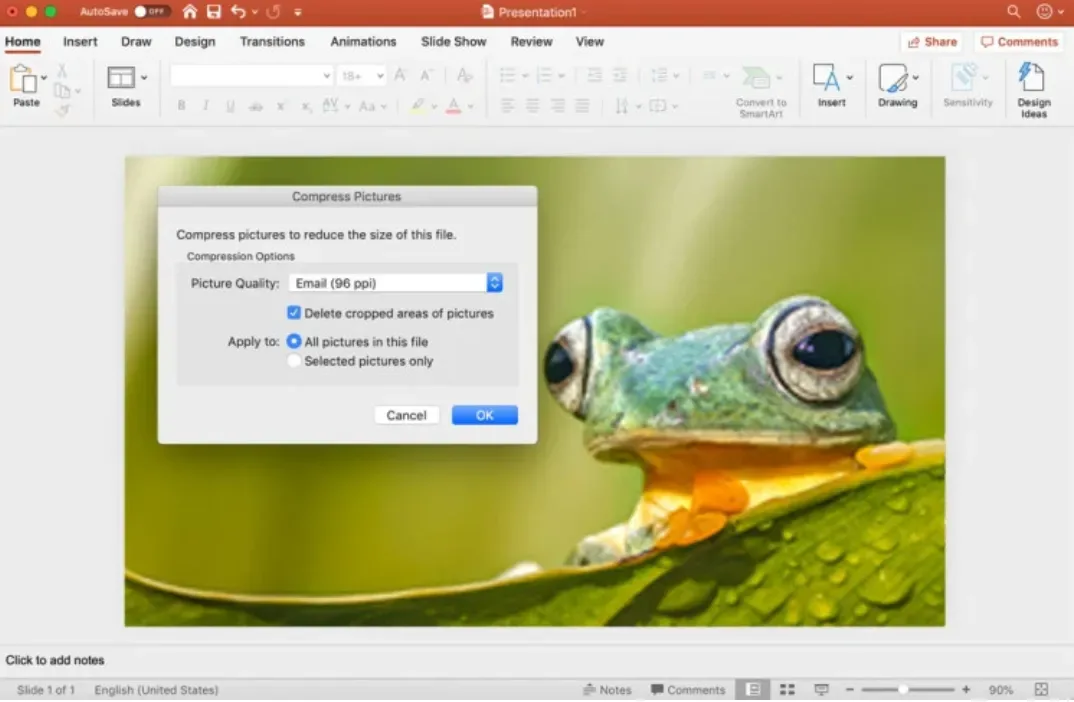
Set the appropriate image resolution in PowerPoint
Although you can drag and drop images directly into PowerPoint, you can also control the resolution at which they appear in the file. To control file size and fine-tune your presentation, you may want to reduce or increase the resolution. Just click File > Compress Image in the main menu.
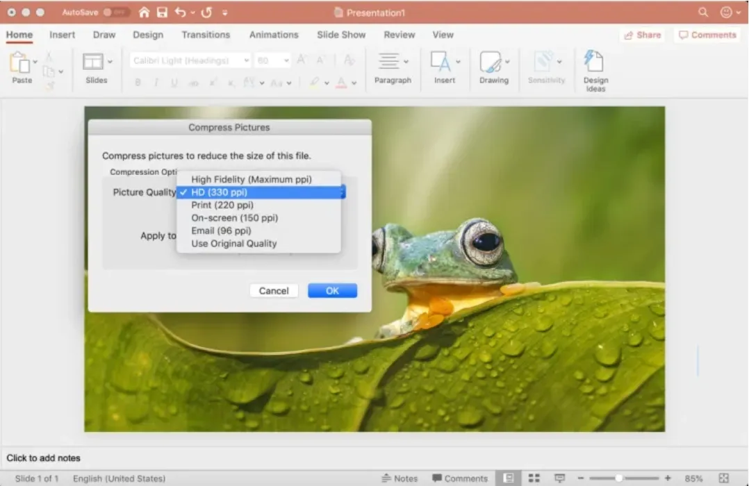
If the presentation file is large and can only be viewed online, you can open it on the screen and check the Apply to: All images in file option to ensure that the remaining images have the same quality.
If you need a higher resolution for printing, please select the print setting. 220 PPI here is very good quality.
For large screens such as projectors, use HD settings, as zooming in to that scale will reveal any resolution deficiencies. Low resolution not only distracts from the message, but also makes the quality look poor, which reflects on the presenter. If size is not an issue, choose high fidelity (highest PPI) and only lower the value if the file size causes computer problems.
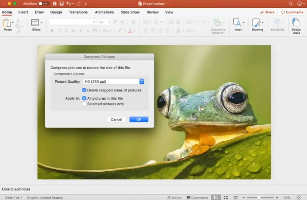
Image quality starts when you add it to a presentation file. Use the highest quality image possible, then let PowerPoint lower the resolution for you, subtracting the excess when set to HD or lower.
Resize, edit and add special effects to pictures in PowerPoint
Powerpoint has a large number of built-in tools for processing images. When an image is selected, the format menu will open on the top toolbar, and an image format window with a confusing name will appear on the right side of the program.
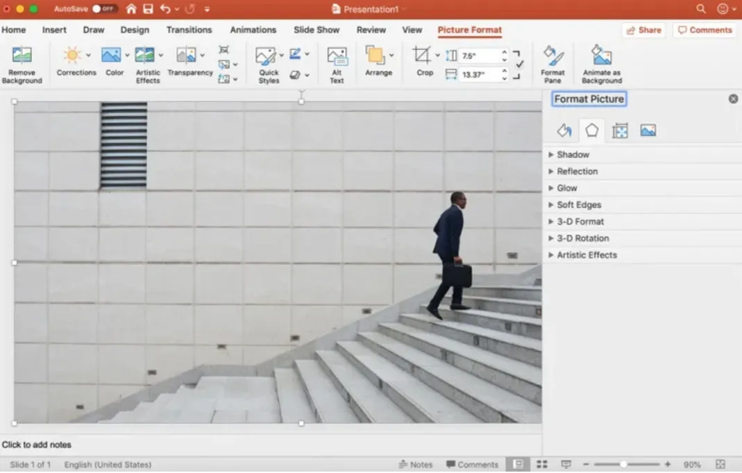
There are four blocks in the picture format menu on the right. Each block can be expanded to display its options by clicking the arrow next to its name:
Fill and Line (Paint Bucket Illustration): Includes frame color, pattern, gradient and background fill, and frame line options.
Effects (pentagon icon): Includes shadows, reflections, halos, soft edges, 3D format and rotation, and art effects.
Size and Properties (Size Icon): Size, Position, and Text Blocks let you control the actual size and position of an image or text block.
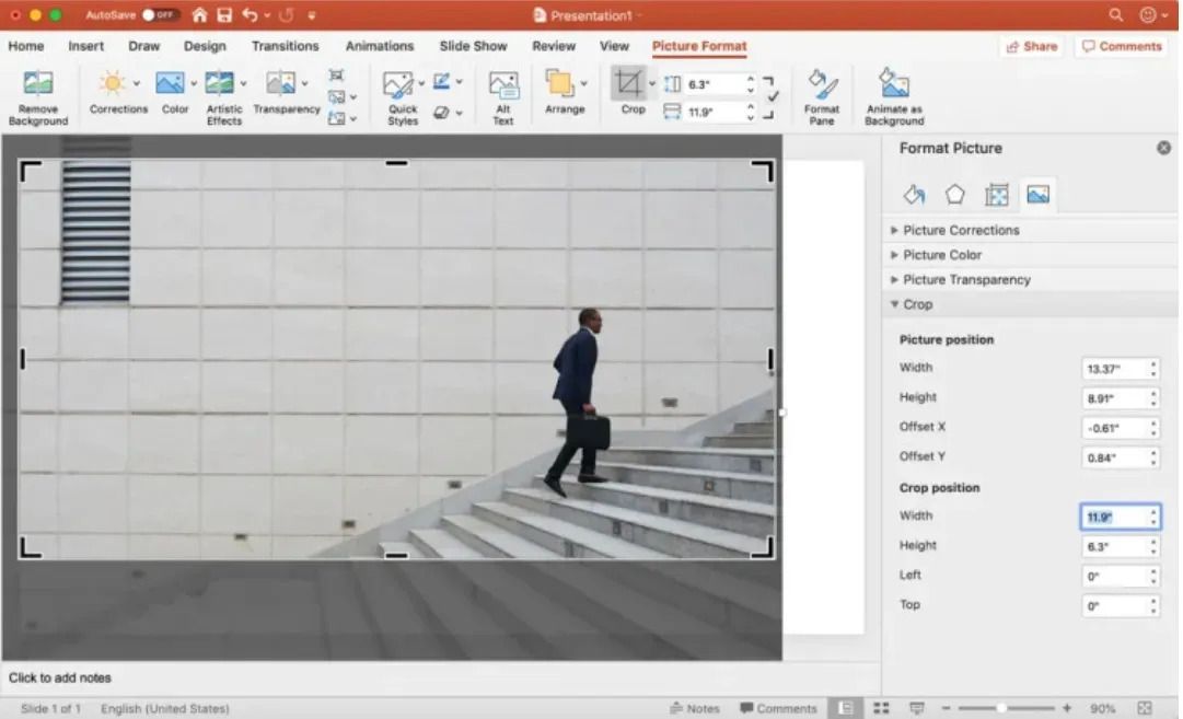
Image (Mountain Icon): Image corrections, color and transparency let you control the appearance of your image. Under cropping, you can change the size of the outer frame that contains the image, rather than changing the overall image as described above in Size and Properties.
The top menu is more comprehensive, including correction, color, effects, animation and other preset menus. In this section, you can crop more granularly than just selecting a size from the image menu on the right.
Crop pictures in PowerPoint
An easy way to crop an image is to use the image options in the image format window on the right. Use the image position controls to move items within their frame, or use the crop position controls to manipulate the frame size.
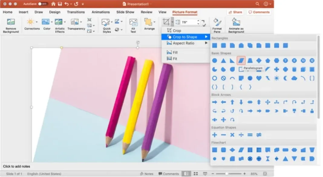
For more advanced controls or special shapes, first select the image you want to crop, then click the Format menu in the top column.
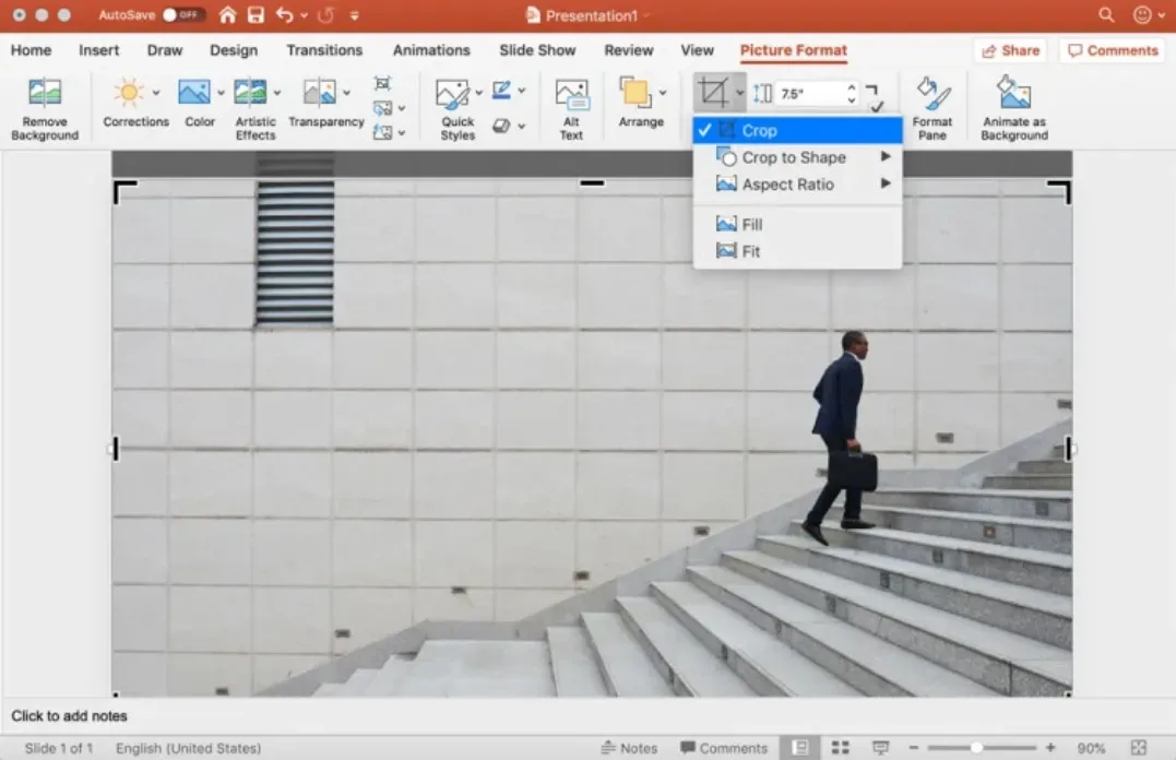
Press the Crop button, then use the frame’s controls to adjust visually. Or, click the arrow to reveal more options, including changing the crop shape (for a creative look) and using a preset aspect ratio to unify the presentation image.
The next time you design a PowerPoint presentation, remember that simplicity is key and less is more. Through these simple design techniques, you’ll be able to deliver a clear, powerful visual message to your audience.
If you still find it troublesome to design presentations, you can try using AI to create presentations. AI can help you complete the presentation production in a few minutes. I recommend Bestppt here. Bestppt provides a large number of beautiful templates, and AI can help you generate slide content and help you with layout.