PPT design is a science that must integrate “creativity” and “clarity” at the same time in order to effectively convey the message, impress the audience and inspire resonance. In modern business or academic situations, a successful PowerPoint is not only the presentation of content, but also a great opportunity to showcase your personal brand. However, while expressing your creativity, you should also pay attention to whether the PPT design is clear enough to convey information! Novices must pay attention to the following 4 PowerPoint layout tips:
(1) Streamlined content
Don’t put too much content on the same slide. This will make the layout confusing and prevent the audience from quickly understanding the main information. Animation effects are also included in the scope of simplification. Excessive use may distract the audience, please use with caution.
(2) The text is large enough
This is often the most overlooked point. If the text is not enough, it will cause reading difficulties. Because the PowerPoint production is close to the computer screen, you will not notice the problems such as the distance between the audience below and the blurred image when you officially go on stage. According to personal experience, the optimal size is: the title font level is greater than 28pt, the content text level is greater than 20pt, and the annotation font level is greater than 16pt.
(3) Visual consistency
Lack of consistent typography style and format will make the presentation look cluttered and distract the audience from where to start. It is recommended to set up the presentation before making it to avoid modifying it midway. Items that need to be consistent include: fonts, color matching, spacing, etc.
(4) Reading guide
This is a more advanced technique. In addition to the basic “horizontal reading, from top left to bottom right” and “straight reading, from top right to bottom left”, it also includes symbolic guidance, such as: arrows, line segments, graphics… …and other different ways. If you are not good at using it, it is recommended to directly apply the layout template provided by the software itself.
3 types of PowerPoint designs
PowerPoint design is composed of “information content” and “editing and layout”. Through the combination of the two, you can create a creative presentation without losing clarity. According to various needs, three basic presentation layout techniques are roughly summarized, namely: “universal PowerPoint design”, “variable PowerPoint design”, and “key PowerPoint design”.
(1) Universal PowerPoint design
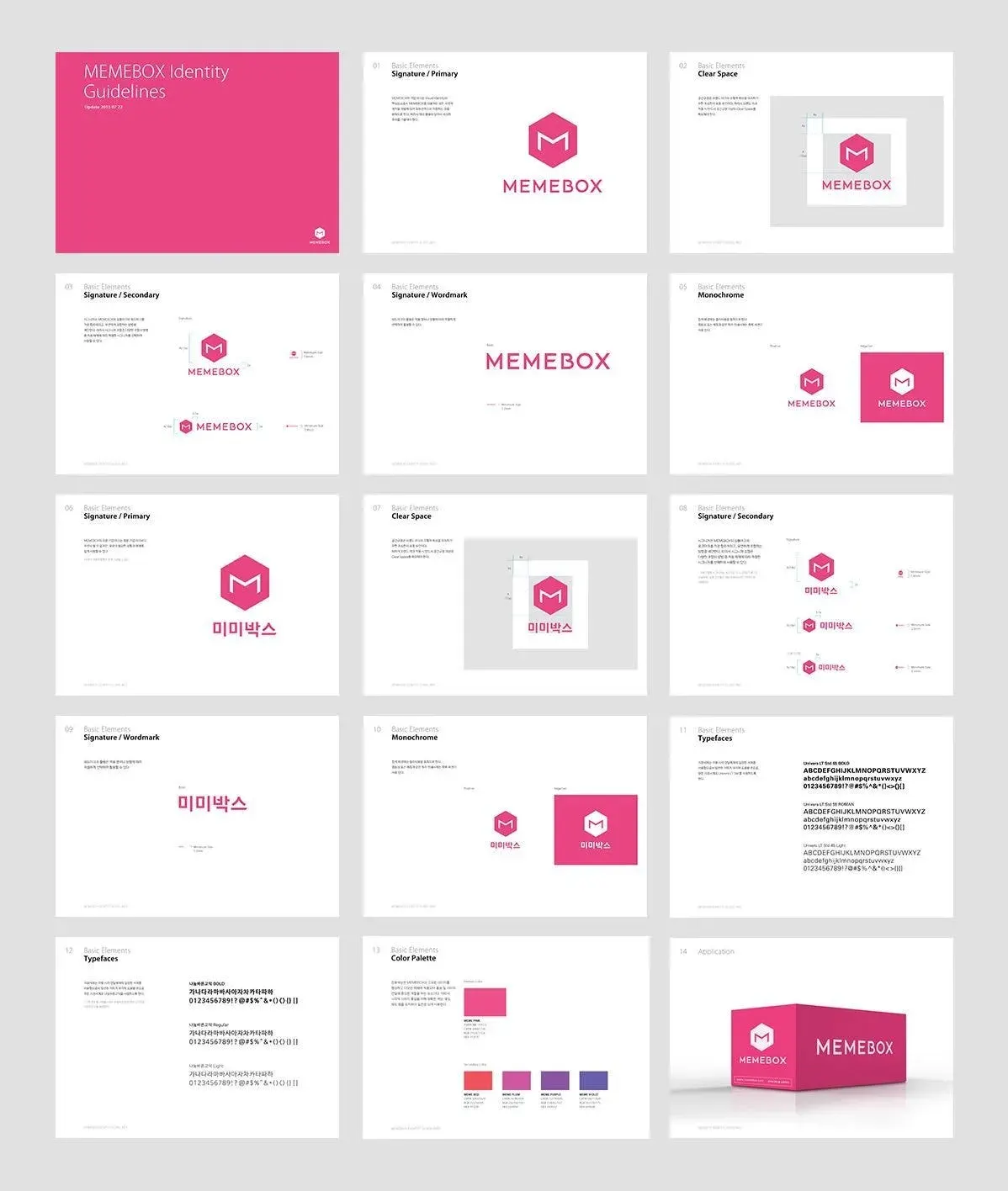
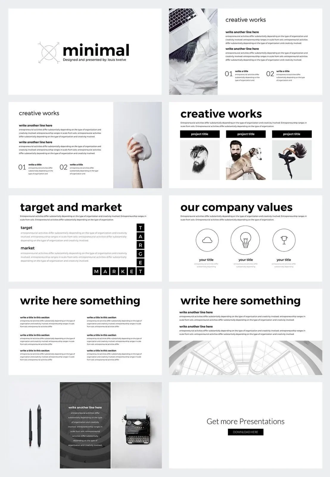
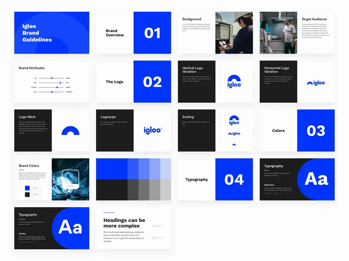
The main feature of universal PowerPoint design is “unified title format and position”. This PPT layout technique is very adaptable and can be integrated into various information contents. It can also smoothly help novices achieve a visual unified effect. This is also The most commonly used one when most people come into contact with PowerPoint.
However, this type of layout can easily produce a monotonous and boring feeling (Figure A). Therefore, when designing, many people will enlarge the font size of the title (Figure B), or use eye-catching colors (Figure C) to enhance the visual sense.
(2) Variable PowerPoint design
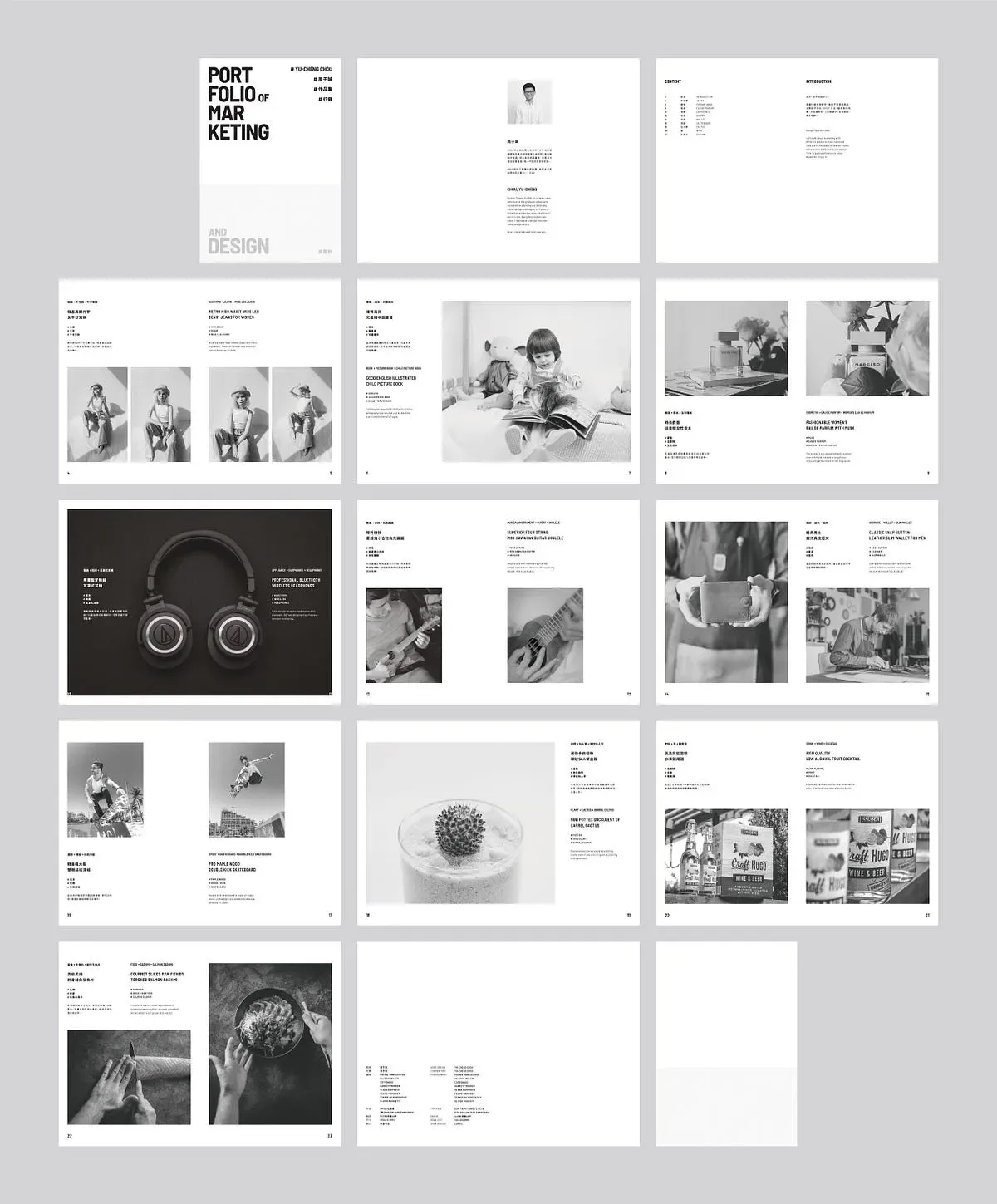
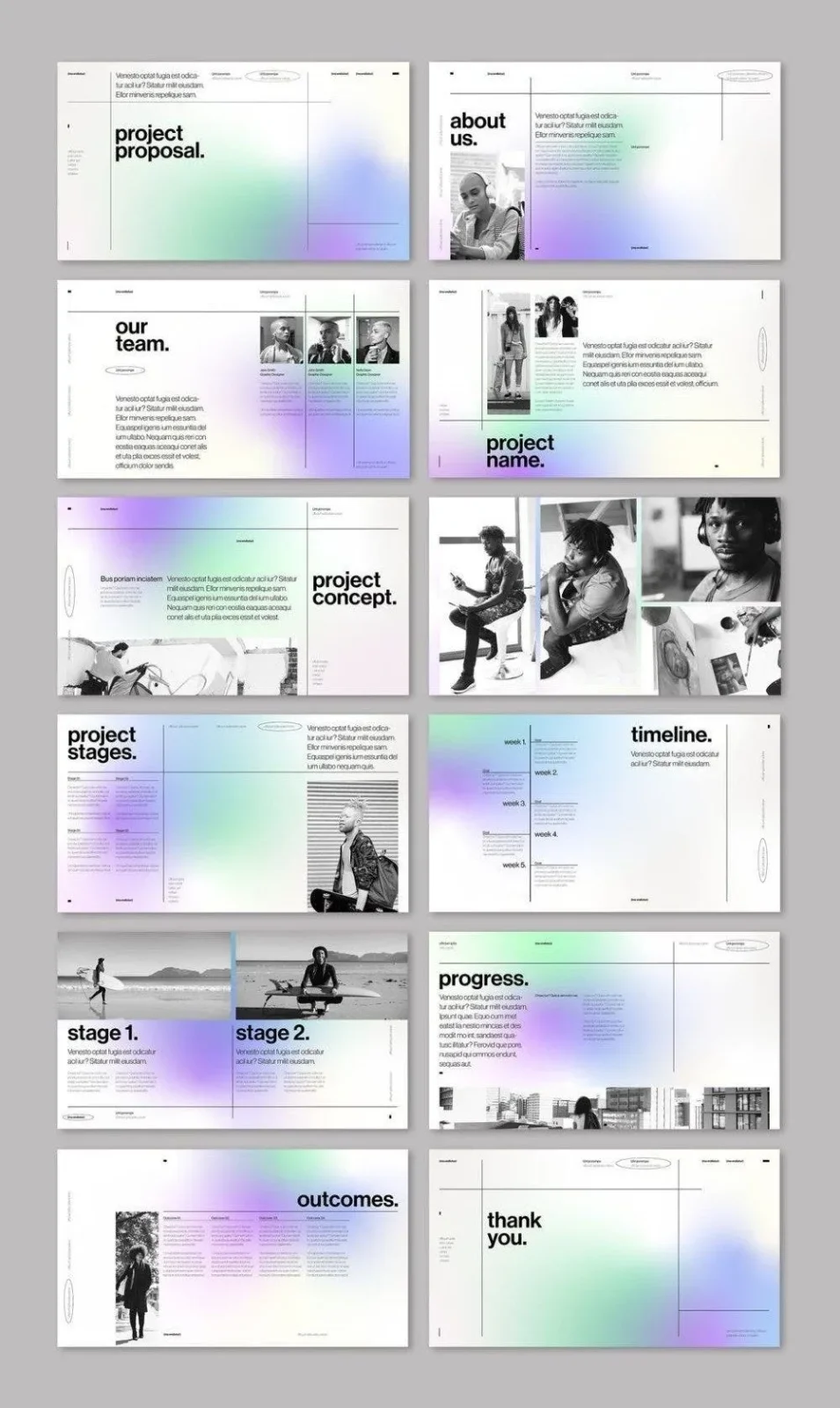
The main feature of the modified simple PowerPoint design is “the title format is fixed and the position changes.” This PowerPoint layout technique can create many changes, including: the title and the content are bound and moved (Figure D), and the title and the content are moved separately. (Figure E) (Figure F).
However, this layout method is not easy to use for PowerPoint content with many information charts. In addition, reading guidance technology is also very important. If you don’t have enough experience, it will easily cause the audience to have difficulties in reading. For novices who are new to this method, they must pay attention to the visual unified standards, and it is recommended to start with the arrangement of bound movements (Figure D ).
(3) Key PowerPoint design
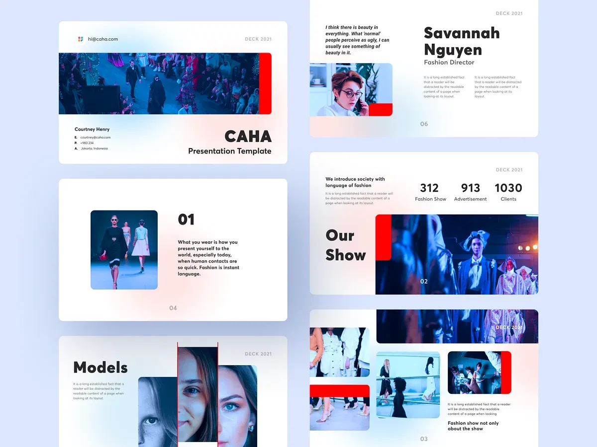
The most well-known key PowerPoint design is the PowerPoint presented by Steve Jobs at the IPhone launch conference. The main feature is “big words with big pictures” and meets the four major PowerPoint layout techniques (concise content, large enough text, visual consistency, and reading guidance). ), allowing the audience to focus on a single point.
The seemingly perfect PowerPoint design actually has a major fatal flaw: it is very challenging to present. This form of PowerPoint will only appear in speeches or sharing sessions, because the audience does not need to discuss with you after the session, so a lot of information and causes and consequences can be omitted. It is not recommended for ordinary people to use it, otherwise it will cause dissatisfaction from supervisors or teachers.

Continuously improve presentation design
Although only 3 types of PowerPoint designs are shared, these are basic styles. There are still many advanced PowerPoint designs that you can try. As long as we follow these layout techniques and specifications, we can still create a PowerPoint with personal characteristics.
