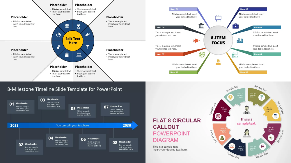
8 Sides Diagram is usually an octagon or eight-part icon, that displays information composed of 8 main components or steps. It is mainly used to simplify complex information and present it to viewers with a visual design, which is easier to understand. However, in actual use, it is not limited to 8 parts; it can also be a 6 sides diagram or a 4 sides diagram, etc. You can make adjustments according to the actual situation.
Advantages of 8 sides diagram for ppt:
Clear structure: complex information is simplified into 8 concise pieces of information.
Beautiful design: 8 symmetrical graphics are more beautiful and easier to highlight the overall effect of PPT.
More attractive: Compared with complex text, graphic information is easier to attract the viewer's interest.
Wide application: concise and powerful design expression, widely used in various scenarios such as workflow, strategic planning, analysis and comparison.
Common uses of 8 sides diagram in presentations:
Business planning: summarize the strategic plan for business development.
Project management: show the 8 key stages or milestones of a project.
Marketing strategy: highlight the 8 components of marketing activities.
Problem-solving: analyze the key causes or solutions to a problem.
These are just a few of the most common scenarios. In fact, you can consider using 8 sides diagram whenever there is a lot of information that needs to be highlighted.
Common 8 sides diagram design methods

Circular layout: 8 parts are evenly distributed on a circle.
Layered layout: The central content is the core, and the 8 contents are expanded from the center
Number marking: Sort the 8 parts and mark them with numbers 1-8
Color distinction: Use different colors to distinguish and highlight the visual effect
How to create an 8 sides diagram in PPT?
1. Add a shape
Go to the "Insert" tab and select "Shape".
Choose an octagon or use different shapes to create the shape you want, preferably symmetrical and beautiful.
2. Add colors and icons
Choose appropriate colors and icons to fit each area and ensure that the design is simple and clear.
3. Optimize the text
Optimize the text to make it concise, clear, easy to understand, and fill it in the corresponding area of the chart.
4. Complete the design
Fine-tune the entire graphic to ensure alignment and beauty.
Tools for designing professional 8 Sides Diagram:
Although PowerPoint is powerful, many tools now provide a large number of materials directly, which can help you make charts and presentations more easily:
Canva: Canva provides more finished materials, which can be freely selected.
Bestppt: Bestppt integrates AI functions. It can help you complete the production of presentations with just one sentence or one file, and provides online editing functions. You can adjust the design according to your preferences 8 sides diagram for PPT.
8 sides diagram is a powerful and beautiful tool for PPT, which can convey information to the audience more clearly and concisely. Through charts, you can make your slides both impress the audience and effectively convey information.
